James Kirkwood
UX - UI - Creative Direction - Art Direction - Conceptualisation
Candy Crush Soda Saga - Senior UI/UX Designer
This is the second time I’ve had the opportunity to work at King. After working in a few leadership roles I felt it was time to go back to to my roots for a bit and pursue my passion for UX and UI design. I was employed as the Senior UI Artist on the Live Ops and Events Team, but because there wasn’t a dedicated UX team member and at the request of my product manager, I also took on the role of UX designer. This was a six month contract that was then extended by another three months.
While working there I
Created and implemented the key art for Valentine’s season.
Created the UI for a new questing system to augment the Season’s Pass.
Designed the UX and UI for the Seasons’s Hub; a new collection feature.
Generic Season Key Art
I was asked to create some key art for to be used initially for valentines season. The artwork needed to have a generic Candy Crush Soda feel to it and is designed to be used whenever there is a small gap in the season’s calendar.
Detective Season, Chapter 1 - UI
The detective season ran for three months, the player needed to complete challenges to unlock clues which would help them to solve a series mysteries. This feature was designed to work in tandem with the season’s pass.
I took this from a loose UX / GD concept, tightening up the interaction design, working out the states required for the quest panels, through to a finished visual design and implementation.
Detective Season, Chapter 2 - UI
After the success of the first chapter of detective season, it was decided to give the player both daily and weekly challenges. This would allow the narrative designer to create a richer story and with the hope that this would improve both engagement and retention.
Season’s Hub - Product Design
Previous seasonal experiences in Candy Crush Soda had always been very closely linked to the season’s pass. It was decided to detach the seasonal experience from the seasons pass. Adventure season would follow on from Detective season in having a series of clues to unlock and a narrative to experience, but it would now have a hub of it’s own hub. To protect the narrative the clues would now need to be unlocked in sequence.
I was asked to provide solutions for both the UX and UI for this feature.
Season’s Hub - UX Core loop
After talking it over with game and narrative design we decided that we wanted to improve on the experience served up to players during Detective season where the clues could be viewed out of sequence. I worked up a new core loop where each clue needed to be viewed in sequence, with the story beats then appearing at the correct moment in the narrative.
Seasons Hub - UX Collection concept
To help foster a sense of mastery and to help reinforce the narrative I suggested that the clues should be saved and displayed as a collection. So that the player could then get a sense of the story at a glance and would then hopefully be driven to collect them all.
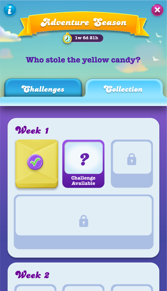
1. Challenge Available
All other challenges are locked.
2. Clue won
Tapping on this ‘parcel’ will open the clue.
3. Expanded clue graphic
This contains the narrative text that builds to tell the story.
4. Clues Collected
Tapping on these will open an expanded version of the clue.
5. Large prize won
Tapping on this ‘parcel’ will open the clue and play the story beat.
Season’s Hub - UX Challenge Screen States
The challenge screen helps the player keep track of where they are in the process. It uses a mechanic reminiscent of a coffee store reward card, where each challenge is represented as a circle with the fourth in the sequence.
Challenge 1 incomplete
No ticks have been earned.
The active challenge is displayed with a question mark graphic.
Challenge 1 completed
The first circle in the sequence is filled with a tick.
A notification badge lets the player know there is a clue to unwrap.
A countdown is displayed to let the player know when the next challenge will be available.
Challenge 2 incomplete
The next challenge is in progress, this is indicated with the question mark.
Challenge 4 complete
The fourth challenge star is filled in to indicate to the player that the sequence of challenges is complete and that the special clue is ready to unwrap.
Season’s Hub - UX Flow
Once I had the core interactions worked out for the challenge and collection screens I could then start working on the various flows to describe how the feature would work with the core game saga and where it’s entry points and wrap up screens would sit and work.
Season Hub - UI Collection Screen
I presented the UX concept to the UX/GD Director and was given the green light to move into the UI phase of the project.
Day 1
The first challenge is available, all other challenges are locked.
Clue Won - Parcel available
I took inspiration from the collectable trading cards from my childhood, which used to be wrapped in waxed paper envelopes.
Collection building up
The collected clues have a bevel and drop shadow on them, to encourage players to tap on them.
First set complete
On completing the fourth challenge the player wins the special clue, which gives them a larger sticker for their collection thus completing the first set.
Multiple clues to open
It’s important that the player opens the clues in the correct sequence. To ensure that they do this only the first parcel in an unopened sequence is active, the others are dissplayed greyed out.
Chapter complete
On completing the chapter the background to the collection changes colour and a reward graphic with congratulatory text is displayed.
Season’s Hub - UI Collection Clues
When the player opens the clue parcel or when they tap on the thumbnail for the clues that they have previously won they are presented with the clue in it’s maximised form. Again I took inspiration here from collectable trading cards.
Season’s Hub - UI Season Introduction, Challenge & Wrap Up Screens
These screens are all designed to contain branding elements pertaining to the specific season and act as a thread running through the experience reinforcing that seasons particular flavour.
Season’s Hub - Animation Story Board
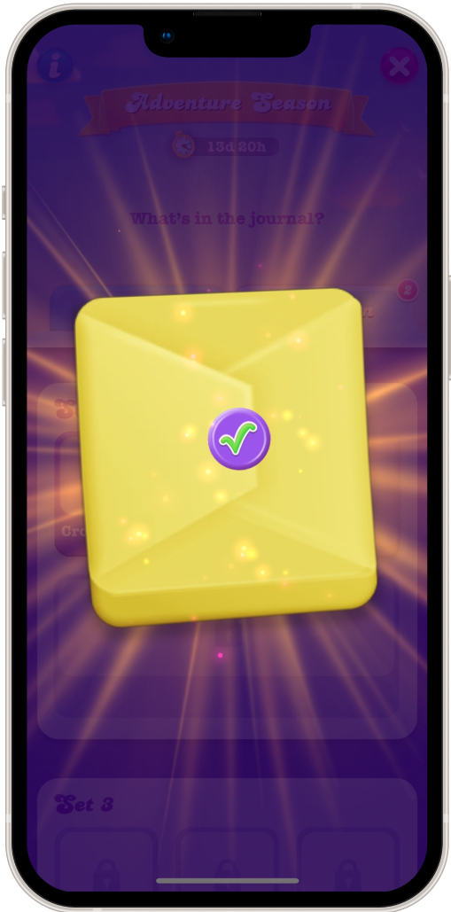
A core part of the Season’s Hub collection experience is the opening of the parcel that contains the clue. I created a storyboard of what I had in mind for this. This was then used as a brief by the visual development team to create an amazing animated sequence.
The story board that I created to brief the visual development team.


