James Kirkwood
UX - UI - Creative Direction - Art Direction - Conceptualisation
Discovery Kids iOS, Android and Web

Discovery Kids is one of the most popular children’s TV channels in South America, Mexico and the Caribbean. I was asked to come in and work as part of a team of designers and developers to redesign their iOS and Android apps and website.
Our team was part of a new division set up in London to provide digital solutions for many of Discovery’s global brands. Throughout this process we would work closely with a product team in Miami and a backend team in Sweden.
My main responsibility would be the redesign of the native iOS and Android apps, but because of my previous experience working on children’s brands I would also be expected advise on the website redesign.
Gathering Requirements

My first task was to gather the requirements for the new app from both internal stakeholders and the Miami team. Throughout the design process we would have daily catch up meetings with Miami and regularly fold their feedback to the designs. The main requirements of the app redesign where:
Improve Navigation Usability - Surface more content on the home screen.
A New Look & Feel - All parties were keen that the app has it’s own unique and perhaps more playful identity.
New Sign Up Flow - Implementation of a new backend system Fusion R, would require a new sign up journey for users subscribed through various South American cable operators.
Personalisation - Giving the user the ability to favourite content, as a way of encouraging sign up. Encouraging users to login was a core business requirement.
A More Playful Approach - Closer in tone to the feel of the TV Channel idents.

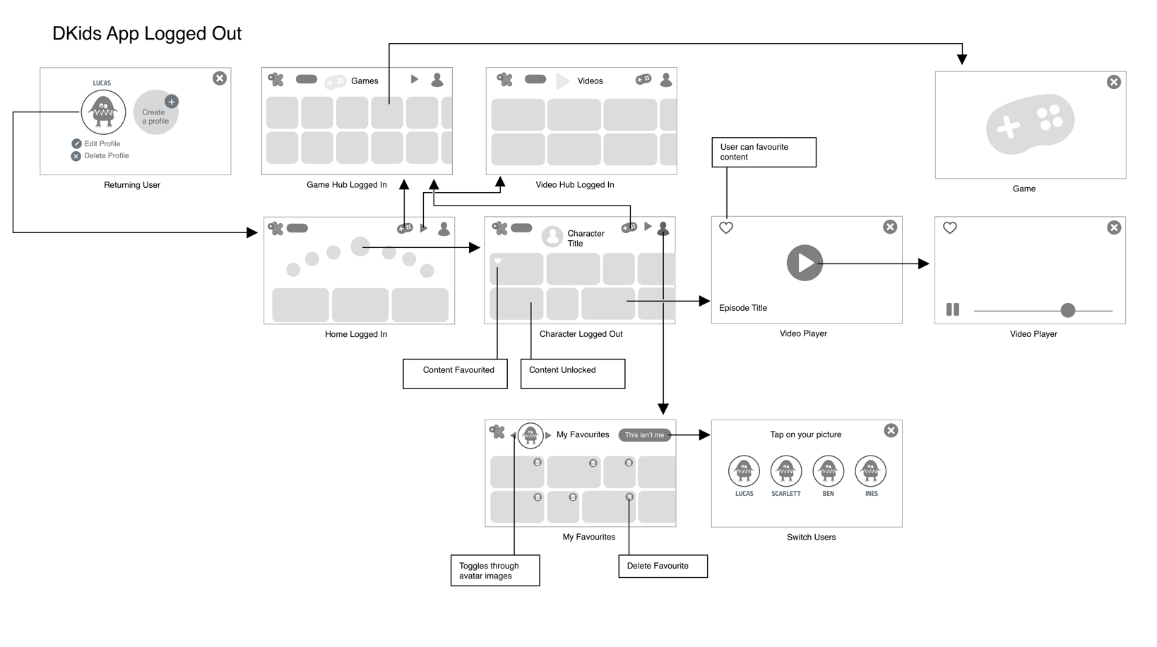
The previous design - The user could view a maximum of three characters in the character carousel and a maximum of two complete content thumbnails at any one time.
The redesign - This allowed the user to view seven characters on the character carousel and up to three thumbnails on the homescreen.
Research and Initial Concepts
I started work on the app redesign by researching other children's apps and websites that offer video on demand and an evaluating their functionality and usability. This research helped inform the early navigation concepts. I find pen and paper is the easiest way generate concepts at this stage, quickly iterating on ideas and showing scamps to other team members for their feedback.

Core User Flow Featuring The Wheel
This was one of the first designs to feature the wheel as a character carousel on the home screen. This helped give the app its playful feel. I’d later rework these screens so that the whole app would work in landscape as some small children drop devices when trying to rotate them.

Defining The App Architecture
To give clarity to the development team and stakeholders. I worked on a series of sitemaps defining the app architecture for logged in and logged out users. We originally planned to have separate game and video hubs, but this had to be scaled back due to time constraints.
Wireframes With Alternate Layouts For Lower Resolution Devices

Android Home Screen Tablet Layout - We later moved away from the double carousel on this particular screen because many stakeholders felt that it made the screen seem crowded

Android Home Screen Phone layout
To make maximum use of the screen estate afforded on different devices, I supplied the developers with alternate designs for tablet and phone. On larger phones and tablets the game and show titles would be displayed underneath the thumbnail. One of the issues we had was that the text underneath the thumbnails would be very small on lower resolution android devices. The solution was to remove this entirely from the phone layouts.
Look and Feel
We kickstarted the visual design phase by generating a a series of look and feel concepts for the website. I worked with another designer to generate a series of look and feel concepts. We presented two options to the product team so that they could either choose one or cherry pick concepts from both. I created the design that they felt was most on brand. Once we had sign off on the initial concept, I worked closely with the web design team to develop a design language that was consistent throughout all digital platforms.
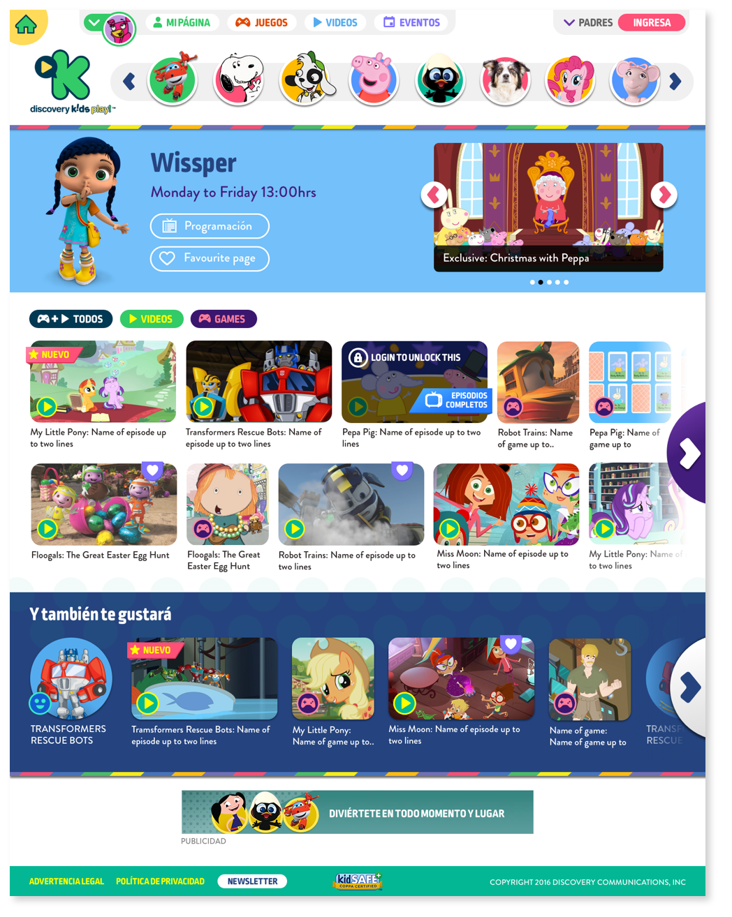
Initial website look and feel, we would use this as a starting point for both the app and web visual design
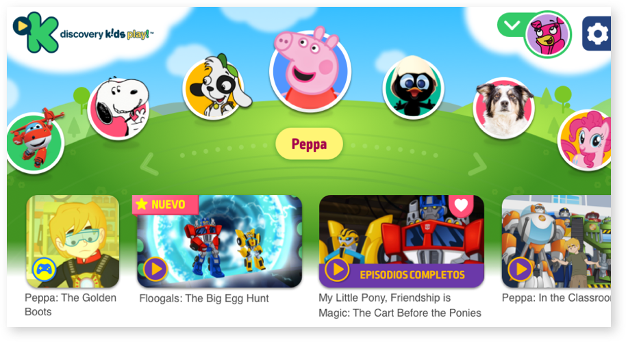
Early app look and feel concept, the hills were considered a little to soft and generic to reflect the brands identity
Reworking the initial look & feel, the hill becomes a planet!

A company called Studio Freak had already created a set of idents for Discovery, featuring amazing planets. I took renders from their 3D models and then softened these so that they felt like an integral part of the design, adding the sky and cloud effects. To enhance the character navigation I also separated the characters from the hill.
The Android version of the app has had over 1 million downloads with over 17 thousand reviews with an average rating of 4.1 stars on google play.

Character Screen Android 1920 x 1280

Character Screen Android 1600 x 960
“James was an invaluable member of our team working on our Kids proposition. Incredibly talented and patient, James is one of those rare designers that can balance both business and creative requirements with flair.”
Parent's and login section

Game container with favouriting option

Error state - all videos fail to load

Video player with favouriting option

Generic error state

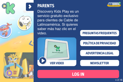
Prompt to log in