James Kirkwood
UX - UI - Creative Direction - Art Direction - Conceptualisation
Token.com / Monolith Head Of Design
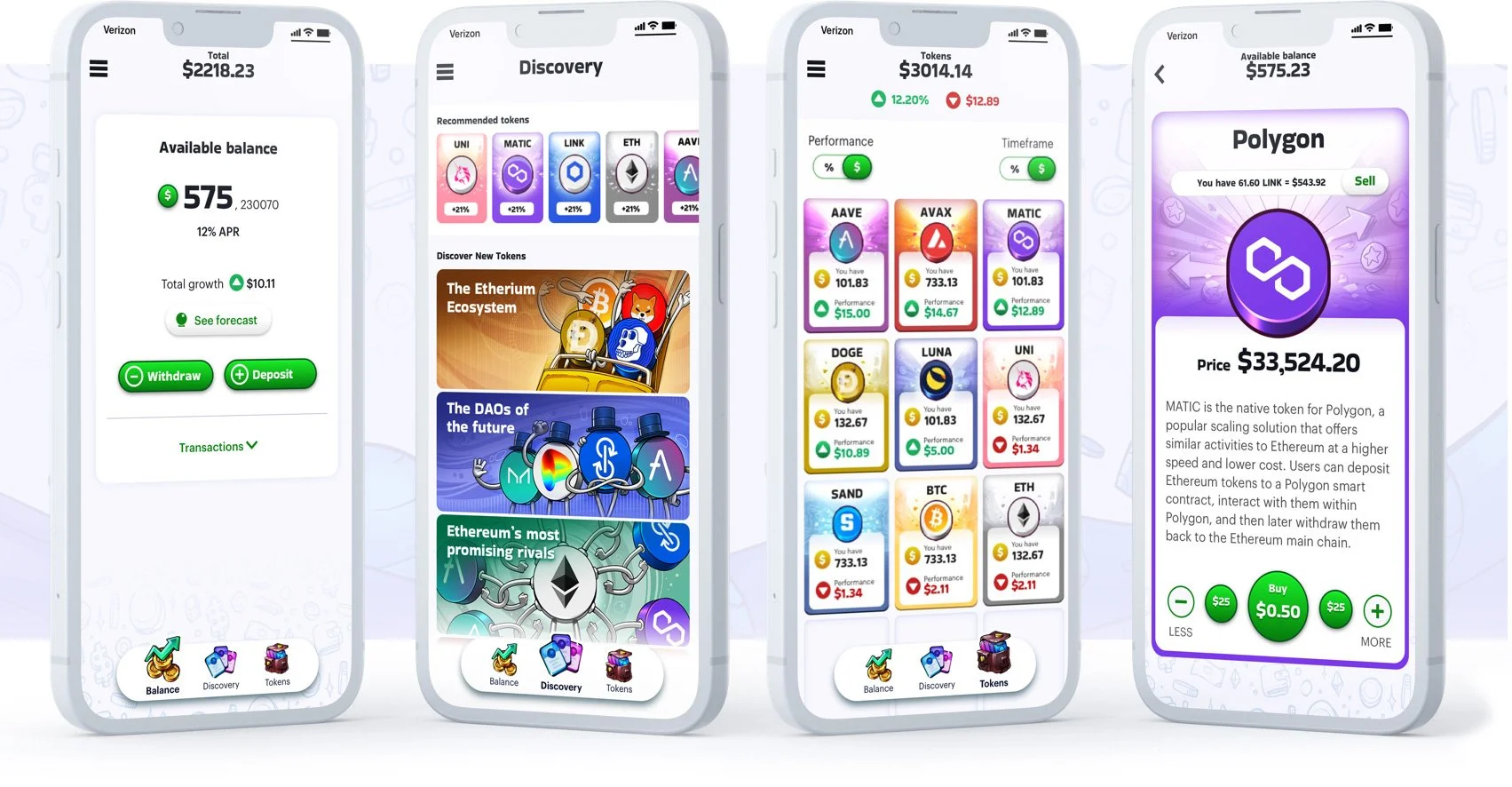
Token.com is a groundbreaking app created by Monolith, which allows users to easily discover, purchase and sell a wide variety of crypto currencies. Soft launched to users in Brazil, the ambition is to create a crypto trading app that is easy to use with a friendly, approachable and fun feel.
How does it work?
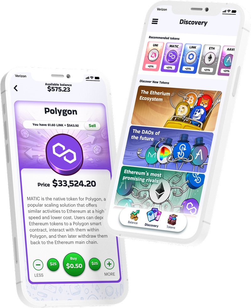
Discovery -
Browse through a selection of curated collections of tokens and recommended tokens.
Card -
Swipe through cards in a collection. Adjust the buy amount and then purchase. Once the user has purchased an amount of a token, the sell function becomes available.
Inventory -
View your portfolio at a glance, order your collection’s performance by either percentage growth or monitory growth.
Balance -
Displays funds available, projected growth of stable coin. Links to deposit, withdrawal and transaction history.
What I did there
Taking an early concept through to a set of fully fleshed out designs ready for release, including all of the various user journeys, user states and providing a comprehensive design system.
Hired a team of product designers and brought in additional creatives to work on branding and animation when required.
Worked from concept through to flows, wireframes, look and feel and then ending in the creation of robust design system
Validated all of this work through user research and amending the designs and re-testing when it was appropriate to do so
Provided a structure where all this work could be reviewed internally and then critiqued and signed off by stakeholders.
Created a pipeline between design and engineering
Who I worked with
Reported to - I reported to the head of product but also had regular catch ups with the companies founders as a way of ensuring that I was aligned with their vision.
Worked with - I worked with three product managers who owned the following areas of the app
Know your customer flow and onboarding
The exchange: purchase and sale of tokens
Balance, transaction history, deposit and withdrawal of funds
I also collaborated with marketing manger and his team who are based in Brazil
Managed - When I arrived the design team consisted of myself and one game artist / conceptualist. We had a very tight deadline so one of my first tasks was to hire three product designers. I also, on occasion employed the services of an animator and a visual designer to help with branding work.
We also worked with a user researcher who was a resource shared between design, product and marketing.
The core design team; three product designers, one game artist/conceptualist and me head of design
Interrogating the existing concept and re-defining scope of work
My first week at Monolith was spent reviewing the product roadmap and the conceptual designs, running through the previous work with the product owners and design team.
Conducting an heuristic evaluation I identified potential pain points and flaws in the existing concept
I recommended a modified design and roadmap to executive board
- Simplifying gamified features features - such as rewards system levelling up
- Reworking the apps architecture to give the app a simpler, less technical feelI then worked with the product owners to identify the core user journeys and define the scope of work required
Setting up a process for UX and design
There was no formal UX process when arrived at Monolith, with most of the previous work having been designed in Photoshop with a focus on individual screens not flows and user journeys. I recommended that we start using Miro to record and discuss our work, which would be created in Sketch and prototyped using Marvel. One of my major achievements while working at Monolith was in convincing the founders of the importance of user research.
UX Deep Dive - Manage Tokens / Inventory and Balance Screens
There are three core user journeys in the app: Onboarding and KYC, Browse and Purchase, and Manage Tokens. The inventory screen and balance screen are at the heart of one of the manage tokens experience.
Kick Off - Workshop User Stories
The design team worked with the product manager to generate set of user stories. I also ran a workshop with the founders and other core stakeholders so that we could gather additional requirements.
Low Fidelity Wireframes
We grouped these and then the designer used them to inform her design decisions, translating stories into features and then later down the line into components. Working out what features should sit on the balance screen and what would feel better sitting in the inventory was one of our core focuses at this point.
User stories where used to inform design decisions
Inventory Screen Early Concepts
There were a lot of different requirements that came out of the workshop, too many to fit comfortably into one design so we came up with quite a few concepts at this stage. One requirement that had been repeatedly mentioned was to have a way of showing the user their recent transactions.
An early inventory concept with recent transactions which linked to a collection view modal
Simplified Inventory Screen - First Prototype
We settled on a simpler design where the user could filter their portfolio by profit, performance, recent purchases and amount held and then toggle between all time and the last 24 hours.
A simplified design with a drop down filtering system
We wanted to know if users would be comfortable this filtering system and if they would be able to see how their investments where performing at a glance. We devised a test where we’d ask users to locate the best performing token over the last 24 hrs and created a prototype.
The results of the test showed that potential users where a little confused, with many not understanding the difference between profit and performance and some not engaging with the dropdown menu. so we decided so simplify our design further.
Our first prototype left users feeling slightly confused
Simplified Inventory Screen - Second Prototype
We replaced the dropdown with it’s complex list of filters with a far simpler toggle allowing users to simply view performance as either a percentage value or a monetary value. We’d got to a good point with our look and feel so could make a higher fidelity prototype meaning we could use colour to signpost positive and negative values. We reinforced this information with chunky arrows so that the screen would remain accessible for users with colour blindness.
Users can view performance as either a percentage and monitory value by using the toggle switch
The results from the second round of user research where far more encouraging
The results for the second test where far more encouraging with the majority of users being able to easily see which token has performed best over the last 24 hours and which has performed the best overall.
We used a similar processes when working through the UX for the rest of the product, always validating with plenty of user research along the way and where necessary reducing the amount of features to make the the product more friendly, approachable and fun for the lay person.
Look and Feel
With no existing brand guidelines, we had a blank canvas to work on when it came to working up the look and feel. There was a strong desire from the founders to make the app feel fun and game like, the other key requirement, which came from marketing was to make the product feel trustworthy. It was important to try and find a balance between these two requirements.
The product’s visual identity needed to be fun and friendly, but also needed to feel trustworthy
Tokens
One of the first things I got the team to visualise where the tokens themselves as these would be at the heart of the product. The majority of crypto currencies have strong branding with clean simply logos and bright colours, relying heavily on the coin metaphor. These coins were to feature heavily on our app at various sizes. Giving the graphics a bit more solidity made them feel tactile, a little more tangible, less abstract. Helping a little in our ambition to make the product feel a little more approachable.
Giving the token graphics a bit more solidity made them feel tactile, a little more tangible
Cards
The initial brief called for the cards feel like trading cards, this was to help make the product feel more friendly and game like. It was also important to give the cards a sense of value, trustworthiness and tangability, so I suggested that we them feel like banknotes, using complex monotone graphics that are often used on passports stamps and currency.
An early iteration of the token trading cards with a banknote feel background graphic
Our initial designs where dark with pale text, these felt hard to read so for the sake of accessibility we settled on a white panel at the bottom of the screen to house the information. This also gave us more freedom to play with the background texture, which was core to the look and feel.
We settled on a white panel at the bottom of the screen to house the information
We worked through a lot of iterations to get to our finished designs, early versions of the cards had quite a few data points on them, this was mostly to help with idea of them feeling like trading cards. We conducted some user research that suggested that most of our potential customers would be happy with a simple description on the card to make a purchase. We removed the additional information from the cards giving us a cleaner design, with space for all of the required elements to breath.
Removing some of the data points from the cards giving us a cleaner design
As there are hundreds of crypto currencies with more being minted each week it was important to find a design solution that was scalable, so that we wouldn’t have to produce hundred of bespoke graphics. To this end the card textures where designed in mono-colour so that they could be tinted, the coin graphic would then be placed separately in the centre of the card.
The mini cards featured in the inventory screen
The micro cards featured on the recommendations bar on the discovery screen
The background textures and coins were designed to be reused on the micro and mini cards. The mini cards featured in the inventory screen and the micro cards on the recommendations bar on the discovery screen.
UI Core Elements
Core elements of the look and feel where a soft purple grey ‘doodle’ texture which allowed us to highlight panels, text fields etc. in white. Nice friendly green buttons with a soft bevel effect. Chunky icons where designed to mirror the feel of the header font. Tab bar icons where given a hand drawn feel which was designed to compliment the coin characters.
Style Guide & Design System
As the team worked through the designs we created a set of rules around colour, font sizes, spacing etc. so that we could create the screens in a systematic way. Creating a design library of components that was then mirrored by the development team who were using Storybook. The team documented this information in a style guide which the development and design teams regularly refer to as a single source of truth.


